Switched Servers
Still working on restoring things from some backups.
Definitely broke my custom theme a bit updating a lot of versions of the ghost blog.
Still working on restoring things from some backups.
Definitely broke my custom theme a bit updating a lot of versions of the ghost blog.
WIP Post: I keep appending to this as I have time. There was so much happening at Build I keep remembering things to add.
A good way to describe Build this year would be last years announcements polished and released. Lots of little wows which I'll go into details below.
One of the amazing things at Build and the community in general is how quickly VS Code has caught on. Many of the sessions used Code as their editor of choice for demos.
Spent my Friday back at the office setting up the Live Share extension on as many co-workers machines as I could. Since we have a mix of Macs and Windows this will allow us to use our own machines when pair programming an issue.
ctrl+p, then
@ - Jump the symbols in the file@: - Jump between Methods/Properties/Variables? - Helpctrl+p+p for the last viewed filectrl+b - Toggle sidebarctrl+j - Toggle bottom panelctrl+k z - Zen Mode
ctrl+shift+z. Use ctrl+shift+p "shortcuts" to change shortcuts.ctrl+` - Opens your default terminalctrl+shift+p "user settings"
editor.minimap.enabled controls the scrolling preview minimap area. I personally find it distracting.window.menuBarVisibility on windows I hide the menu bar since I rarely use it.div>div#id.cls with tab.1+3+4/2 ctrl+shift+p "math"While Microsoft is making great progress on their PWA support the slide below is from Google IO and shows they still have some things to release.
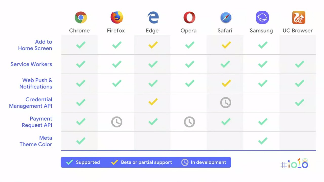
For devs Service Workers is very important, but Custom Elements or Shadow Dom are still missing. Their priorities still seem to ignore community feedback (but I'll try not to turn this section into a rant).
Was so busy before Build I still haven't updated one of my projects from 5 to 6 yet. Hopefully get to that this week, but looks like some great additions to the command line tools.
Unfortunately 3D and game dev is not something I get into very much as I primarily focus on enterprise development, but I'm always amazed at how quickly full 3D environments are coming to the web.
So, my top takeaway for me is I want to code a real time demo with Angular 6 and SingleR to an Ubuntu box.
While I like Azure a lot more my personal projects I always let them live on one of my Digital Ocean boxes.
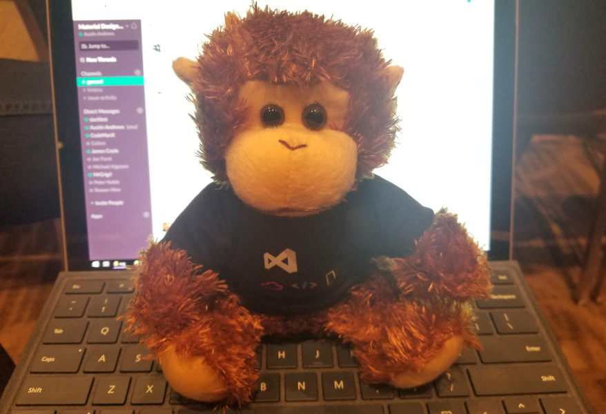
This year the Adaptive Cards team had a lot to show off as their spec and demos are getting implemented into more parts of Windows/Skype/Outlook and more.
What would be a Microsoft event with HoloLens. The April update added a ton of awesome features which should make development a little easier. The interesting part is that while the devices were everywhere they are just treated as a normal business device now.
During the conference Microsoft admitted they had overstated the uses of HoloLens in the consumer space and emphasized that the consumer market is not a goal at this time.
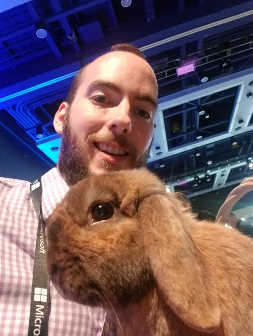
Oh yea... there were bunnies (rabbits).
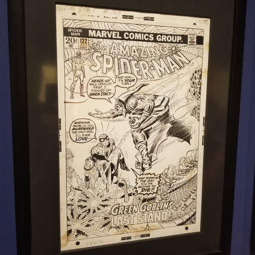
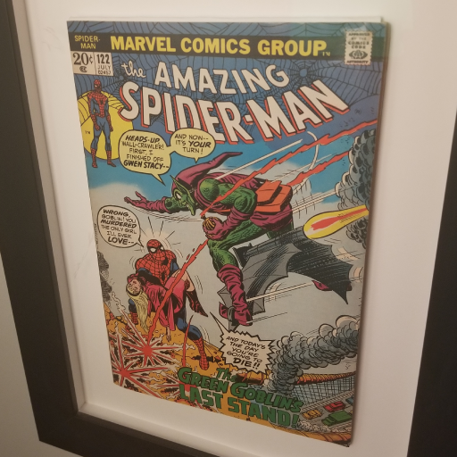
Going through the Museum I did not expect them to have the ink for Spider-Man 122. I've had this framed on my wall for a few years now and it's one of my favorite covers (an 8.5 for the geeks curious).
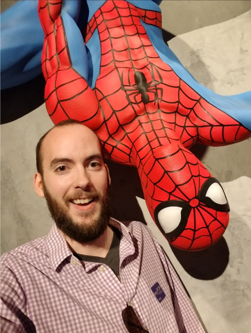

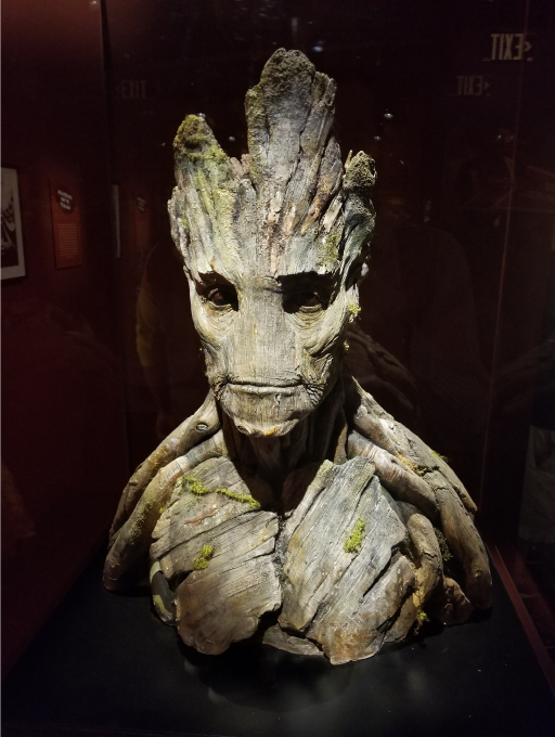
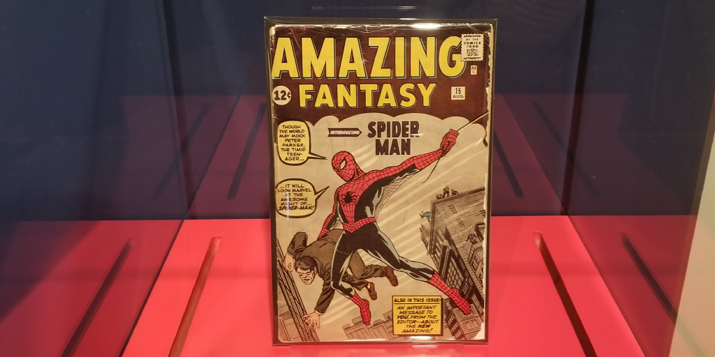
The Star Trek exhibit was also a lot of fun to see. My dad kind of brought me and my bro up on Star Trek, so interesting to see all the history.
Adobe XD is in beta right now and an ideal environment for building high fidelity mockups and prototyping out ideas quickly. Now with the new layers panel added the app is getting closer to becoming a viable tool for end-to-end creation of designs.
Got the chance to talk with someone on the Adobe XD team at Microsoft Build and the future of the application is sounding very promising.
Hopefully shortly we'll see the ability create third party extensions. Of course the first extension I would want to build is for the Material Design Icons pack.
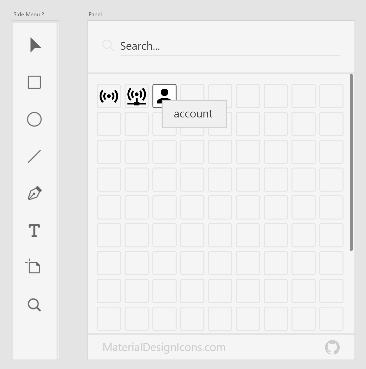
The extension would basically allow one to quickly incorporate the icons in their design. With Material Design Icons Light variant open sourcing shortly this could fit nicely into wireframes also.
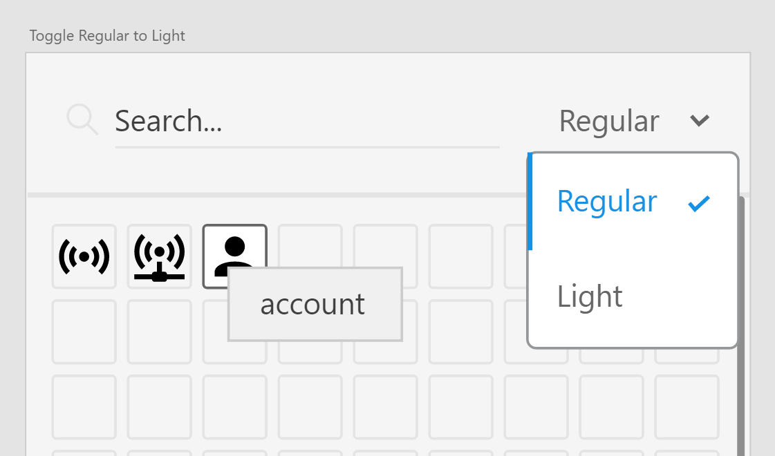
This keeps the extension simple, assuming the user will select colors using the normal color selector.
Ideally once the extension API releases I'll be able to get this coded over a weekend for others to use.
Figma is an awesome little web based application for collaborative designing and it does it very well. The tooling is relatively straightforward within a short time [using it roughly a week now] I was able to design reusable components and design out some of the starting pages.
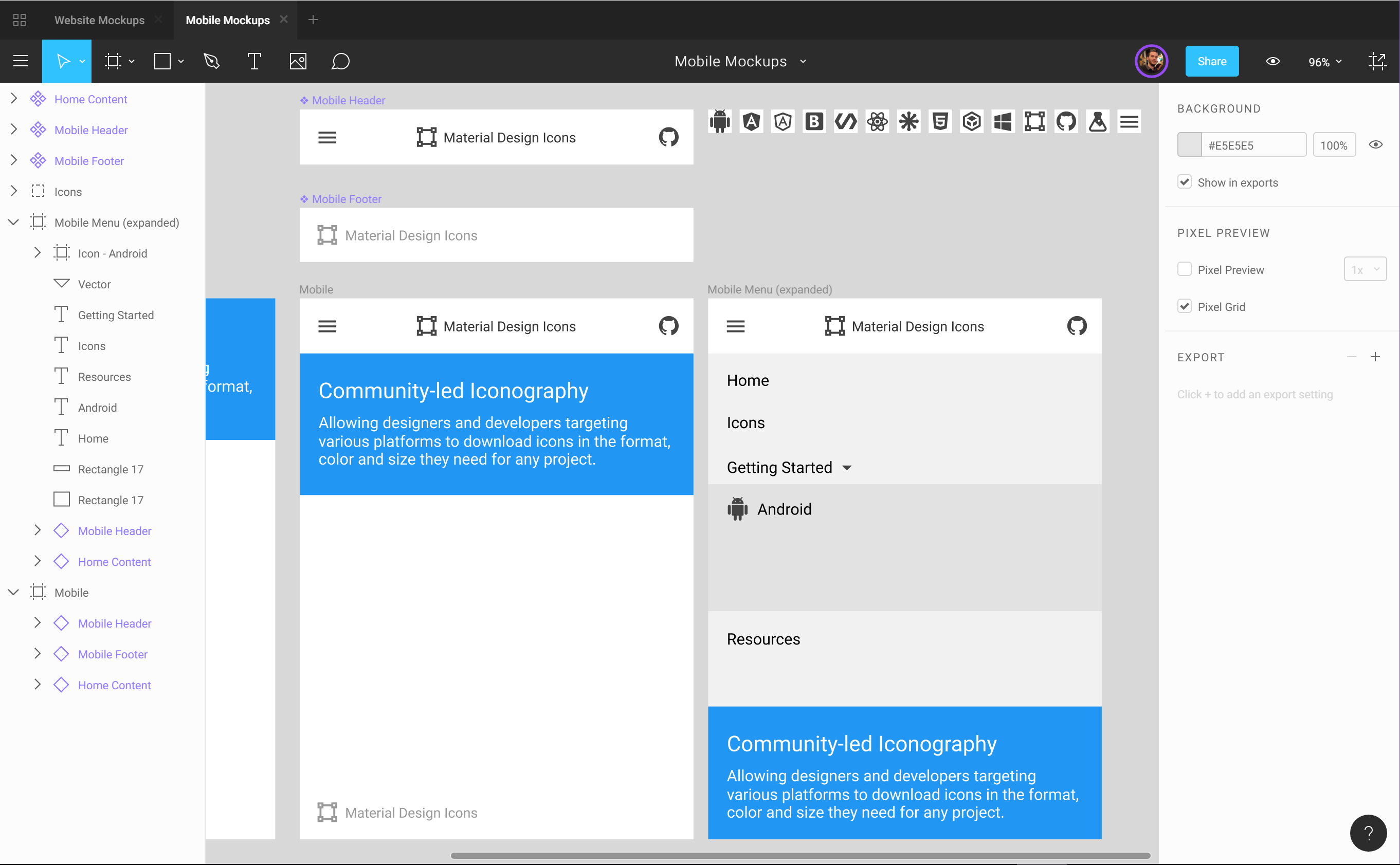
Above is a rough mockup I'm working on for the mobile view. The desktop mockup is shown below also in a very early work in progress. Using these more as light ideas, so alignment issues are from my laziness.
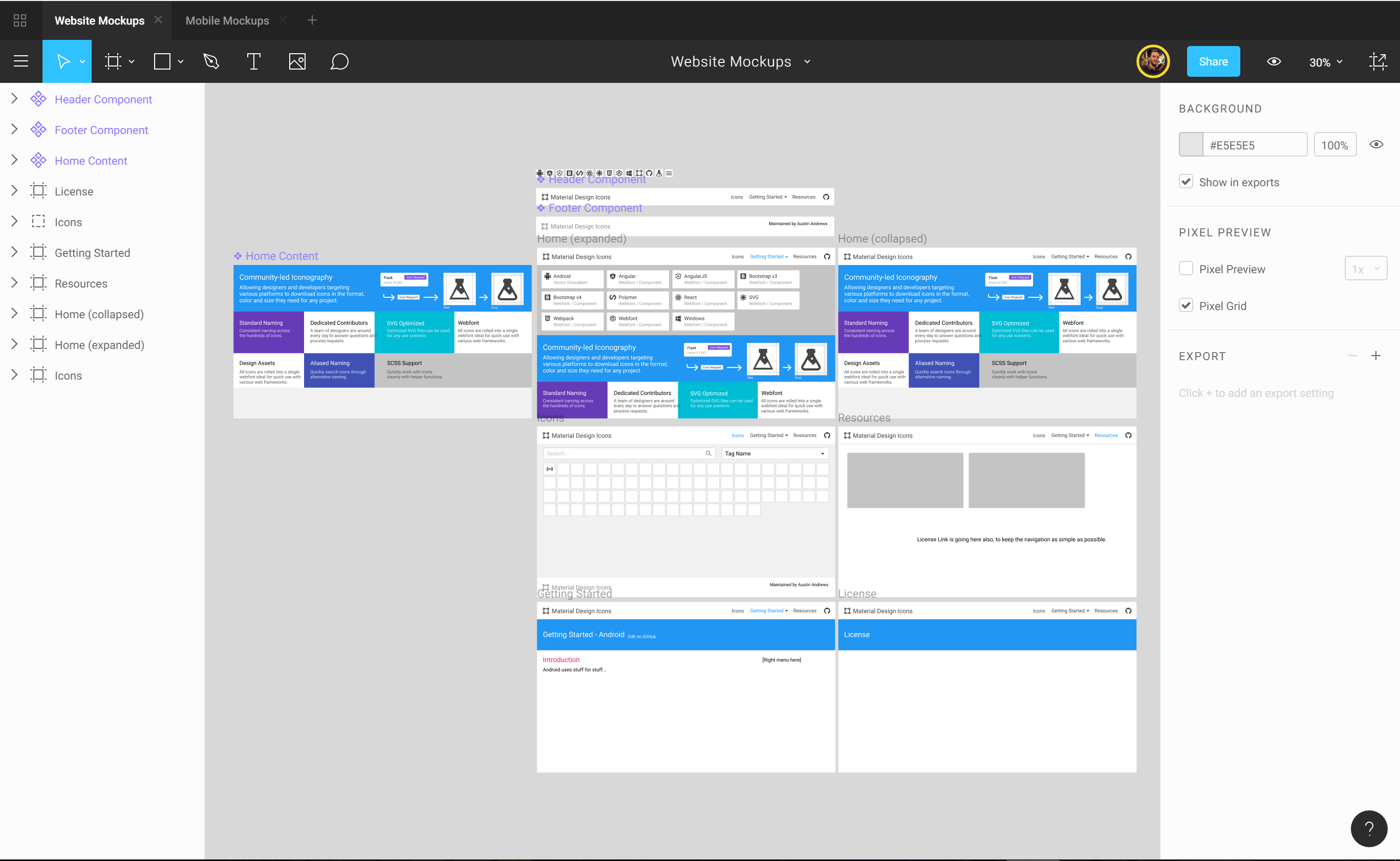
Impressive vector tools, really hard to explain without a video or trying them. They are some of the best I've ever used and I hope others copy them.
I mainly work by myself on designs, but the idea others can jump in and make slight text changes and modifications on the colors is pretty nice.
I work with all vector assets no images, and I've found the performance really good overall (on a Surface Pro 4 w/ i7). We'll see how this does as I expand the designs.
Snapping objects even with hundreds of objects on the screen was smooth, especially dragging between various artboard frames.
For an application built on web technology you would be hard pressed to tell while it's in the desktop client.
AdobeXD is the future for my workflow, but until they get further along, which will probably several months, Figma is filling the void nicely. Figma's collaboration might be enough for me to stick to it for all my open source projects.
If you're a Sketch user you probably won't make a switch, but the collaboration is worth a try.
Preview: Website Desktop Website Mobile
GitHub topics was introduced January 31st and allows a quick way for maintainers to tag their repository for others to find.

In the repository list the descriptions for an repository become much more important. As more projects add topics a small change can be made to stand out like prepending an emoji.
Any emoji's can be used along with arrows to bring attention to the applications.
Examples: 🎁📦🕶👓💎🎤✏🖊🖋✒🖌💼📁📂🗂
Hopefully this doesn't get abused, but for now it's a nice way to stand out a little more.