Modern Day Hieroglyphics
Was lucky enough to be a speaker at Grand Rapids Dev Day this year (March 12). The talk is setup for a 30 minute session to give developers an overview on iconography.
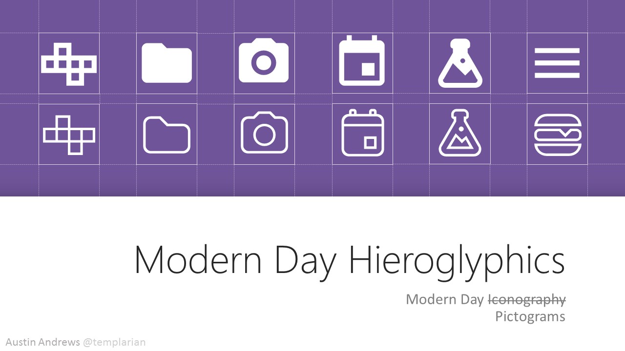
Introduction slide. Giving those waiting for the talk to look at some icons in 2 different styles.
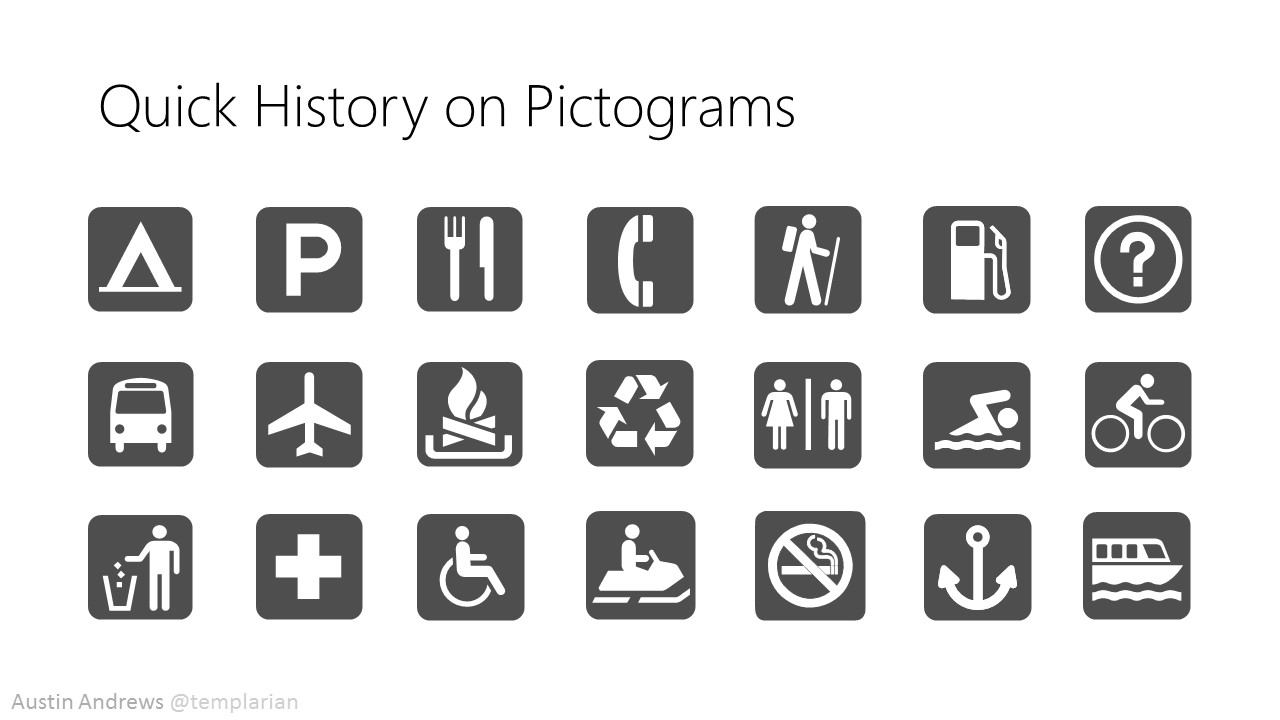
What really makes a pictogram is the ability for it to be quickly recognized. Here in the talk I go into ambiguity and the ways people might interpret an icon in certain contexts.
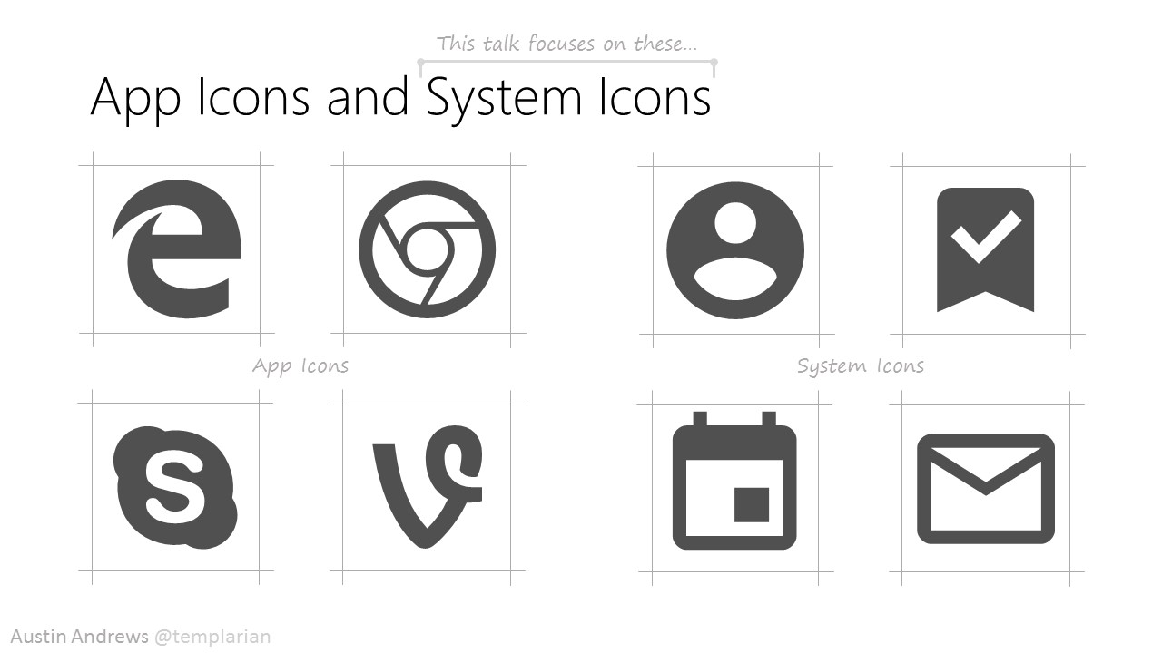
Explaining the difference between a logo and a system icon. This talk primarily focuses on the use of system icons.
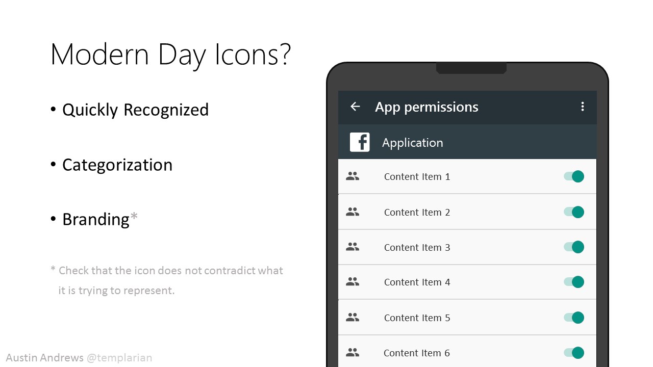
So, the talk is about modern day icons and how and why we use them. The key to their use is for them to make the action or elements quicker to recognize. There is the idea of using icons to represent categories and for larger applications icons can also mix into the branding.
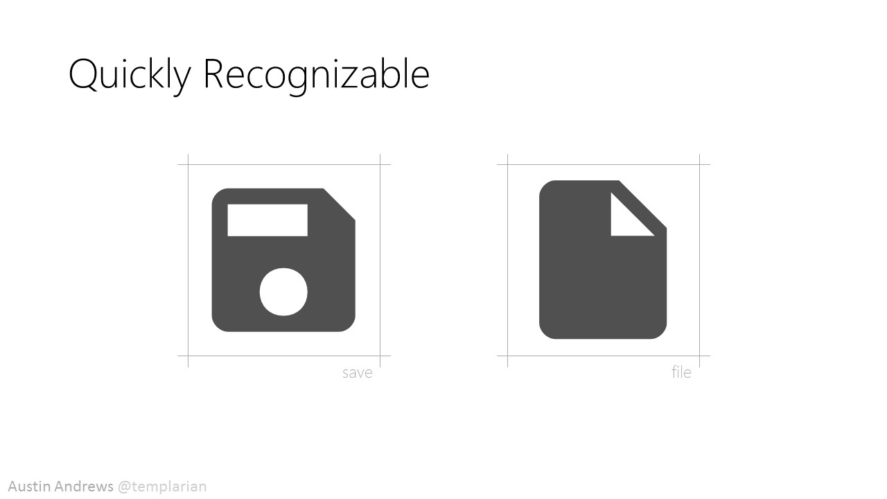
Quickly recognized icons we're familiar with. The save icon, which lets us save 1.44MB of data. And the file icon which when pressed takes your digital document and turns it into a piece of paper I assume.
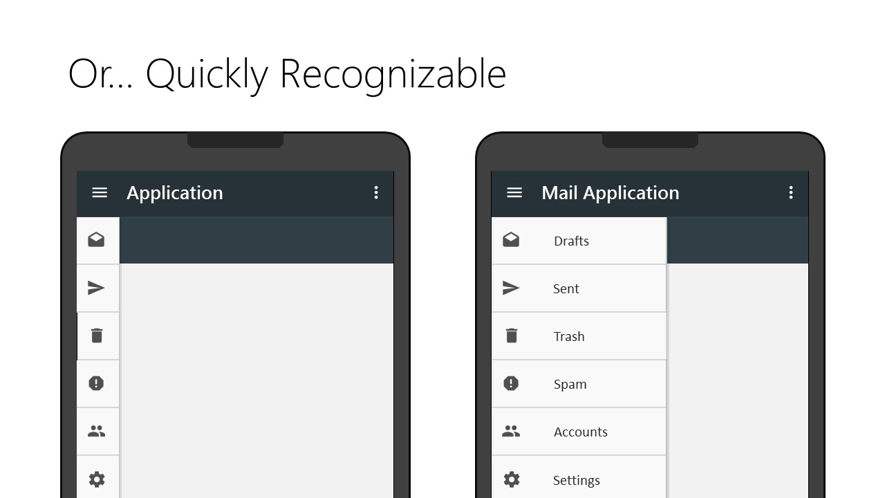
More serious slide, quickly recognizable icons can by themselves represent the action without text or tooltips. A common example seen in many applications now-a-days is the fly out menu.
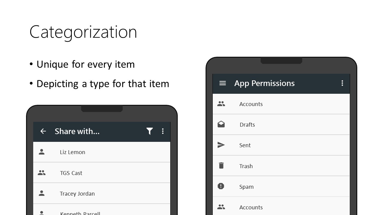
Screen space especially on mobile devices is more limited and showing category defining data on each item with text can add clutter. One way around this is to use icons. Files / Folders, People / Groups, and Important Items can be represented this way. Categories can also be top level navigation items or filters as seen in a permission screen.
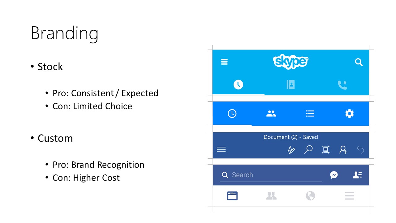
Branding is one slide I could talk about for a while, but will keep this brief. Branded icons are icons that fit a consistent style, but do not match the operating system's built in guidelines. This is usually not recommended, but can be done for applications with a strong brand recognition. Skype, Office, and Facebook have this, while others will opt for consistency with the OS.
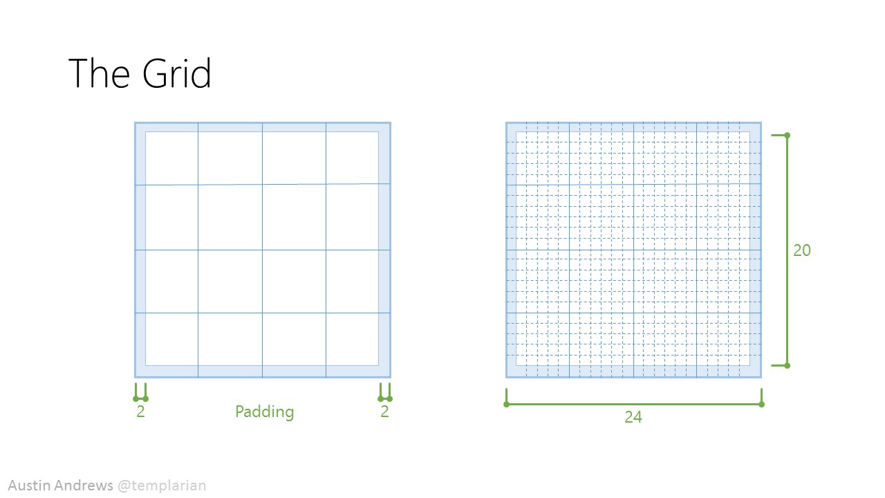
We now have a high level overview of icons, but what makes up a good icon. To understand this we start with the base guidelines that all icons start with. This are determined by the style and built around a grid. In this case we're going to use Material Design to illustrate this. Material Design system icons are built on a
24dp(display pixel) grid.
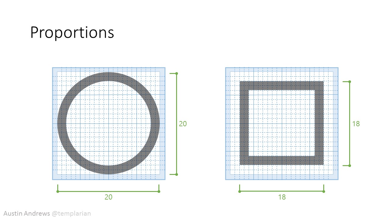
One quick concept when working with icons to grasp is the idea of proportions. Each icon takes up a certain area of the grid, but for them to view in a uniform way vertically and horizontally next to each other they may need to fill out the grid differently. A good example of this is a circle and a square, visually they look uniform, but the circle is taller and wider.
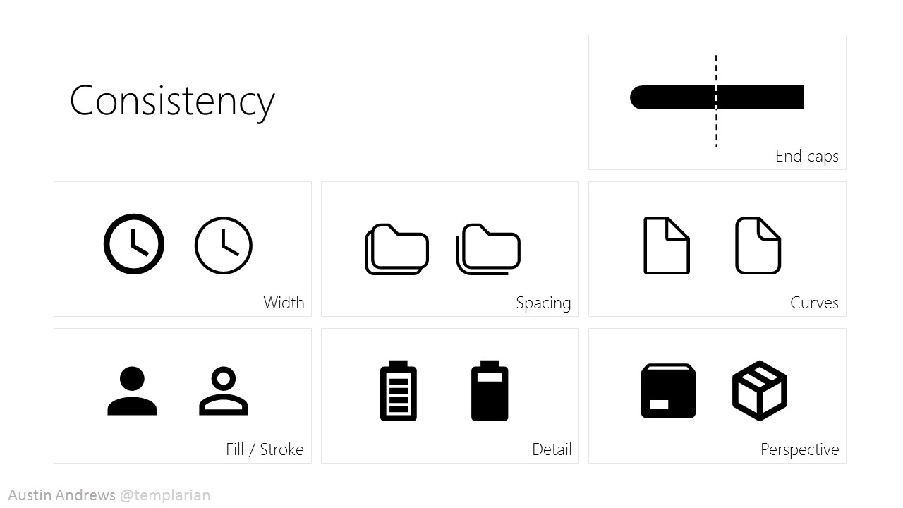
To extend more on this idea of uniformity lets look into each of the ways an icon can be consistent. This slide is self explanatory, but know that icons can work together if all of these don't match. The most important ones are width, curves, and fill/stroke. To make things easy most icon packs ship with a uniform style, but keep these in mind if cases when a 3rd party icon needs to be adapted where the pack is missing a specifically needed icon.
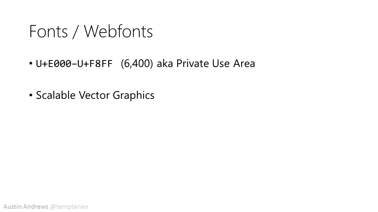
Now a lot of people work in web, and there are two main ways you can make use of icons. Not going into which is better or worse, but just how to use them and how they work. Webfonts are becoming the norm for including many icons and making quick use. This works by taking advantage of the Private Use Area of the unicode spec. A font can include 6,400 user defined characters. The next is SVG or Scalable Vector Graphics which are supported now in all major browsers and can be inline included with the
<svg />tag or referenced via the<img />tag.
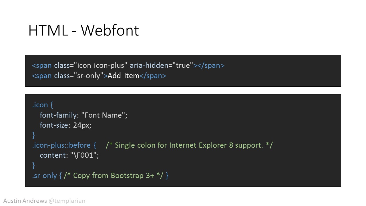
Webfonts like 'Font Awesome' and 'Material Design Icons' allow quick inclusion into a page, but require loading every icon, so are less ideal when only a handful of icons are required.
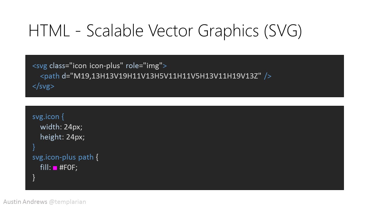
Scalable Vector Graphics have a nice advantage in that they can be included inline either by hand our by third party JavaScript libraries and styled via CSS.
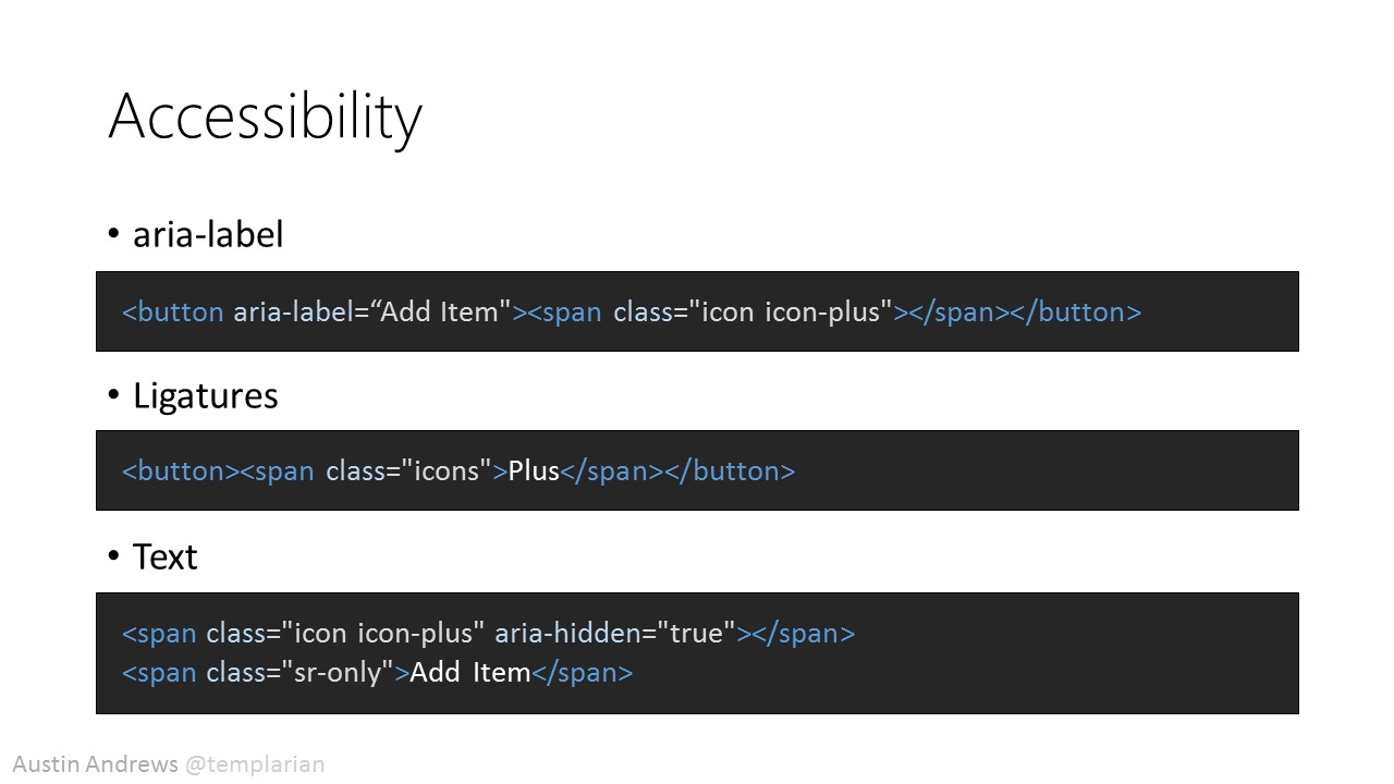
Touching on accessibility really quick before diving into more designer topics. Remembering that visually impaired users will not be able to see your icons it will be important to add some accessibility markup. This can be done a few ways aria-label lets you reword whatever is in a button with a custom description. Ligatures are not ideal, but some webfonts support them and is the idea that letters next to one another should be represented by another unicode. In this example
Pluswould swap for the webfont's plus symbol. In a lot of cases an icon is a representation of an action and not the noun, so this can add confusion. The more ideal solution is to usesr-onlymarkup as seen in the Bootstrap framework.
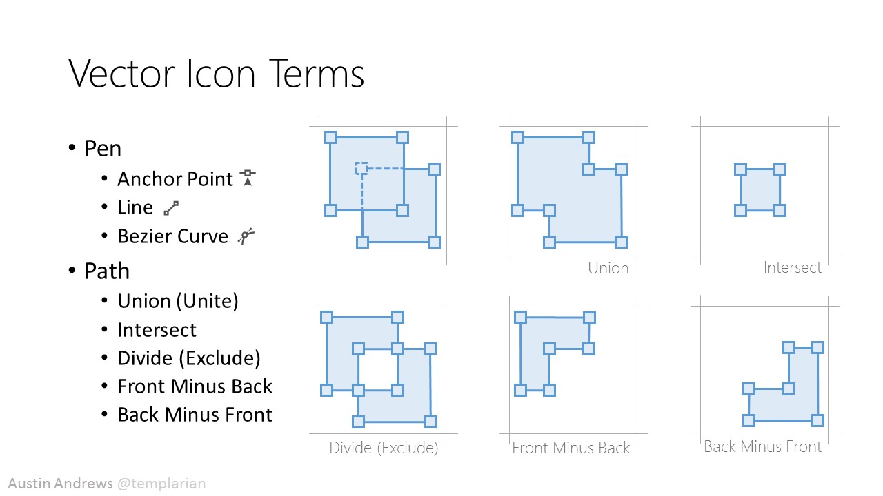
Self explanatory slide of all the terms I'll be using in the demo and how they relate to vector objects.
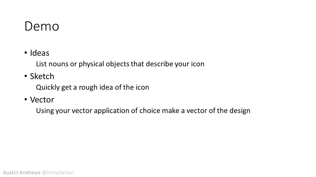
The demo details the process one would go through working with a designer or the steps a developer can take to create an icon.