Release of @mdi/react

Today we released the first version of the @mdi/react NPM package. Hoping this helps with adoption of Material Design Icons in exisiting ReactJS projects.

npm install @mdi/react

MaterialDesign-React

import Icon from '@mdi/react'
import { mdiAccount, mdiLoading } from '@mdi/js'

const Example = (props) => (
  <div>
    <Icon path={mdiAccount}/>
    <Icon path={mdiLoading} spin/>
  </div>
)

Props

path: string - SVG path data. Usually from @mdi/js
size: number, string (1) - {size * 1.5}rem
horizontal: bool (false) - Flip Horizontal
vertical: bool (false) - Flip Vertical
rotate: number (0) - degrees 0 to 360
color: string (#000) - Ex: rgb() / rgba() / #000
spin: bool, number (false) - Ex: true = 2s, {spin}s

@mdi/js ?

The @mdi/js package contains all the icons after each release as both CommonJS for Node and a module for use with import/export. Ideal for TypeScript and ES6 developers.

What about x Framework

The team is working on VueJS and Angular 6 components that will offer similar functionality. In the future we'll hopefully get to other more niche frameworks.

PrismJS VS Code Dark Theme

This blog post is used to test the PrismJS VS Code dark theme that this blog uses.

A lot of attention to detail around JSX, JavaScript, TypeScript and HTML has been carefully crafted to match VS Code. Lot of random ugly hacky CSS is used to handle most of the common uses cases in JSX.

import * as foo from '@foo/bar'
import foo from '@foo/bar'
import { foo } from '@foo/bar'

export default class foo extends something {
  func() {
    // testing
    /* testing */
    const foo = 'bar';
    let bar = true;
    var test = { object: "test" };
    var jar = 2;
    var a = () => { return 'test'; };
    var b = function() { return 'test'; };
    var b = function foo() { return 'test'; };
    return (
      <Test foo={'test'}
          bar={true}
          test={{ object: "test" }}
          jar={2}/>
      <a href="#">Test</a>
    )
  }
}

Scripting with NodeJS and Material Design Icons

The team has been active working on building out scripts to generate helper libraries for various uses of Material Design Icons. This got me to thinking it might be useful to share how easy these scripts can be to write.

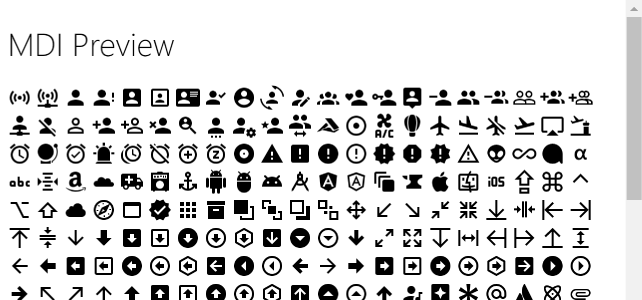
Goal: Write a NodeJS script that takes the @mdi/svg package and converts it into a easy to view preview.html.

I picked this since it accesses the meta.json (this contains all the meta information about each icon, like tags, aliases, etc.) and in the end generates a single html file.

Prerequisites

  • Empty Folder named "preview"
  • NodeJS Installed (for npm command line)
  • Visual Studio Code (or another editor, but my examples will use this)

The NodeJS command line will allow us to pull down some helper scripts and execute our build.js we'll be writing.

NPM Init

The first step will require you to open a command line of your choice (CTRL+tilde in VS Code).

  • Run npm init in your /preview folder
  • Press enter a few times to accept all the defaults.
  • Run npm install @mdi/svg @mdi/util

Awesome, you will now see a folder called node_modules this contains a copy of the latest version of the SVG's and the meta.json file.

Note: If you want to see the meta.json open it and then run CTRL+P followed by typing format. This will format the JSON file.

Creating the Build Script

The build.js file is below. We'll break down what each part does and what the @mdi/util provides.

const util = require('@mdi/util');

const fileName = "./preview.html";
const version = util.getVersion();
const meta = util.getMeta(true); // withPaths

const body = meta.map(icon => `
  <span onClick="a('${icon.name}')"
        title="${icon.name}">
    <svg viewBox="0 0 24 24">
      <path d="${icon.path}" />
    </svg>
  </span>
`).join('');

const template = `
  <!DOCTYPE html>
  <html>
  <head>
    <meta charset="UTF-8">
    <title>Material Design Icons - Preview</title>
    <style>
      svg { width: 24px; height: 24px }
    </style>
    <script>
      window.a = x => alert(x);
    </script>
  </head>
  <body>
    <h1>MDI Preview</h1>
    ${body}
  </body>
  </html>
`;

util.write(fileName, template);
console.log(`\u2714 Build ${version}`);

The @mdi/util includes a few helper methods for working with the @mdi/svg package's data with NodeJS.

  • util.getVersion() Get the semver formatted string major.minor.build of the current @mdi/svg release.
  • util.getMeta(true) Get the meta.json data. Passing true will parse the SVG folder for path data assigning it to .path.
  • util.write(file, data) Write data to a file.
  • util.read(file) Read data from a file.

View the util.js to understand these utilities.

Update package.json

In the package.json a new script needs to be added to handle build.

"scripts": {
  "test": "echo \"Error: no test specified\" && exit 1",
  "build": "node build.js"
},

To run the build execute npm run build.

MDI Preview

Wrapup

Hopefully you found the above tutorial useful and allows you to create more complex build scripts.

Ghost CSS Formatting Images

I recently switched to using the awesome Ghost blogging platform and while styling I was stuck finding a way to format images next to each other in a grid pattern. I came up with a quick solution that looks like:

Ghost Image Columns

In my site I wanted to pull the images to the left and right 10px outside of the <p> element. This makes them standout a bit more from the text that has a 20px margin.

Ghost Grid

Using the markdown syntax ![]() place each image on their own line (up to 4 in a row) for them to resize into a neat column format. Preview an example in my Microsoft Build 2016 post.

.post p {
    position: relative;
}

.post p * {
    box-sizing: border-box;
}

/* One Image */
.post p img:first-child:nth-last-child(1) {
    width: calc(100% + 20px);
    border: 1px solid #DDD;
    margin: 5px -10px 0 -10px;
}

/* Two Images */
.post p img:first-child:nth-last-child(2),
.post p img:first-child:nth-last-child(2) ~ img {
    width: calc(50% + 4px);
    border: 1px solid #DDD;
}
.post p img:first-child:nth-last-child(2) {
    margin-left: -10px;
}
.post p img:first-child:nth-last-child(2) ~ img {
    position: absolute;
    right: -10px;
}

/* Three Images */
.post p img:first-child:nth-last-child(3),
.post p img:first-child:nth-last-child(3) ~ img {
    width: 33.3333%;
    border: 1px solid #DDD;
}
.post p img:first-child:nth-last-child(3) {
    margin-left: -10px;
}
.post p img:first-child:nth-last-child(3) ~ img:nth-child(2) {
    position: absolute;
    right: 33.3333%;
}
.post p img:first-child:nth-last-child(3) ~ img {
    position: absolute;
    right: -10px;
}

/* Four Images */
.post p img:first-child:nth-last-child(4),
.post p img:first-child:nth-last-child(4) ~ img {
    width: calc(25% - 3px);
    border: 1px solid #DDD;
}
.post p img:first-child:nth-last-child(4) {
    margin-left: -10px;
}
.post p img:first-child:nth-last-child(4) ~ img:nth-child(2) {
    position: absolute;
    left: calc(25% - 4px);
}
.post p img:first-child:nth-last-child(4) ~ img:nth-child(3) {
    position: absolute;
    right: calc(25% - 4px);
}
.post p img:first-child:nth-last-child(4) ~ img {
    position: absolute;
    right: -10px;
}